Educating natural history museum visitors on the new geological era
We partnered with Carnegie Museum of Natural History in developing Healing in Progress, a system of interactive exhibits aimed at engaging museum visitors in learning about a new geological era and experience human's impact on natural landscape.
Role
Design Lead Design Strategist
Timeline
01.2019 - 05.2019
Collaborator
Xi Jin
Context
Scientists say that "nature," untouched by humans, is now almost entirely gone.
Carnegie Museum of Natural History (CMNH) is curating an exhibit - We Are Nature: Living in the Anthropocene. It is the first in North America dedicated to Anthropocene, a proposed geological epoch where human activities are the main driving force for changes in earth's landscapes and systems.
Problem
Anthropocene often appears hard to grasp and carries negative connotations for an average museum visitor.
Media portrayals for Anthropocene tend to focus on the doom and gloom and evoke a pessimistic view in its audience. Through this exhibit, CMNH wants empower visitors and encourage them to make thoughtful changes. CMNH came to us, looking for new addition to the exhibition.
Solution
Healing in Progress helps visitors internalize the relationships between human activities and natural landscape through storytelling of the formation, impact and treatment of AMD - Acidic Mine Drainage - the largest water issue in Pittsburgh.
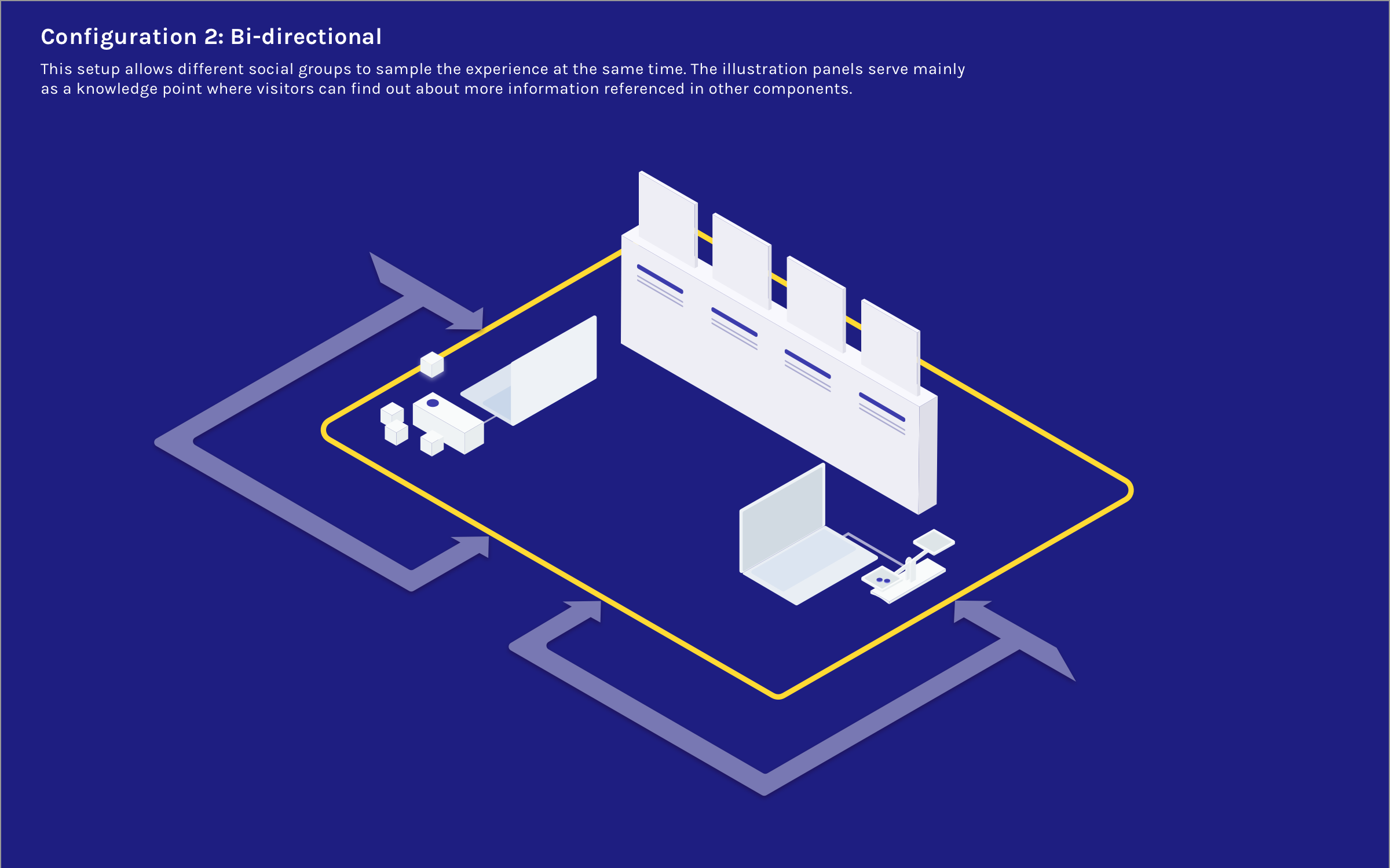
Element 1: digital balance | impact of AMD
Visitors can place glass pieces onto the balance plates to simulate the equilibrium in nature. The physical balance is attached to a potentiometer, which reads the tilt and signals the Arduino board to trigger different graphics on the display screen.
Element 2: RFID + wooden blocks | treatment for AMD
In front of another screen, there are wooden blocks attached to RFID tags that store information on the main agents in a few current treatment methods used in Pittsburgh or PA regions. Visitors can place the blocks near the reader to learn more about how these agents improve local water quality.
Element 3: illustration panels | formation of AMD
I illustrated panels on the formation of AMD. This series depicts how human activities have shaped the natural landscape - specifically, how coal mining in the past has led to the increase in the acidity in water systems.
We applied modular design for each component of the exhibit, which allows the exhibit to adapt to different configurations based on the setup of the museum.
Client Feedback
I love the mediated experience between me and the exhibit. Great use of technology. This is incredible.
— Curator for Anthropocene at Carnegie Museum of Natural History
I like your solution-oriented design, and the "balance" seems like a good entry point to the issues of Anthropocene.
— Director of Exhibit at Carnegie Museum of Natural History
Research & Scoping
Aligning on mental models
Anthropocene is a broad topic, and the use of this term is still up for debate. Our team focused on a sub-topic, Altered Landscape, which we defined as the impact of human activities have on the natural landscape.
What does “Altered Landscape” mean for museum visitors? To answer this question, we conducted 6 Personal Meaning Map studies with museum visitors - our "end users". We handed visitors a piece of paper with “Altered Landscape” in the center and asked them to map out terms they deemed relevant to the topic.
After affinitizing the Personal Meaning Maps and surveying local landscape, we decided to focus on telling the story around mine drainage, which carries a legacy from coal mining in Pittsburgh.
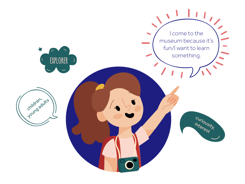
Understanding our users
We conducted observation studies at the museum to understand who we are designing for. We also referenced the five museum identities according to their motivation for visit by Dr. John H. Falk and created two visitor personas.
I noticed that visitors usually came in groups, amongst them many parents with children.
Defining success
Setting learning objectives
We referred to Climate & Urban Systems Partnership (CUSP) Theories, which proposes three principles for informal learning: Participation, Framing for Relevance and Local Systems Understanding. We set three learning objectives to evaluate our design:
We want to increase visitors' awareness of AMD's existence and the relationship between human activities and changes in natural landscape.
We want to help visitors understand the scientific principle behind the treatment of AMD. (knowledge)
We want to promote visitors' interest in environmental issues and make more informed and thoughtful decisions.
This is a learning model I created, adapting from the CUSP model.
Design Iterations
We first designed a facilitated conversation kit focusing on the neutralization of acidic water. We chose common household items so that 1) it's safe for young visitors to get hands-on experience in the museum and 2) it's easy to replicate these experiments at home.
We also recognized that we wanted to be the facilitators - to enable learning, and not dictate learning. Therefore, we designed conversation points to encourage 2-way communication where visitors can reinforce their learning by participating in discussions.
Here are some snapshots of our first prototype:
We brought our prototype to the museum for a 3-hour-long testing session. We were able to have conversations around the kit with 9 groups of visitors, 8 from around PA area and 1 visiting from Buffalo, NY. After our tests have concluded, we ran a conversation analysis to understand the types of learnings that happened during visitors' interactions with the kit.
Notable takeaways
1. Our exhibit needs to provide more context.
Visitors frequently inquired about more details for AMD - for example, they were curious about how AMD came into being, how the treatment onsite works in real life, etc. We realized that to promote a systematic understanding of the human-nature relationship, we needed to go beyond presenting the issue in isolation, but rather tap into how it relates to visitors' day-to-day life.
2. Our exhibit needs to frame science in an approachable manner.
Since many of our visitors are still early in their science education, our kit became less engaging when we started talking about chemistry terms. Through conversation analysis, we learned that making reference to real-life examples was a good strategy to enhance learning.
Leveraging technology
Taking learnings from our last field tests, we knew that we wanted to design an exhibit with more visual details, pared-down science concepts, and interactivity. We then researched exhibits on similar topics to see how other designers have approached it.
I made a variety of sketches which we used to communicate with our client for alignment.
Our visitors vary in experience levels with the topic, so we used technology such as RFID tags to store information into modules, so that visitors can decide what they want to learn and easily access their desired piece of knowledge. In addition, we also coded an interactive piece in Processing which enables visitors to experience the different outcomes resulting from their actions.
Testing balance + Arduino reading
Testing RFID tags
We designed each piece in the exhibit to be its own vignette, and the modular set up allows the exhibit to be easily reconfigured to adapt to its physical context. However, to help visitors understand the connections between these stories, we designed for them to fit onto one table. Here's a diagram I made, showing the relationship between different components.
Prototyping & Testing
We used a variety of tools and techniques - laser-cutting, clay-sculpting, Arduino, to name a few - to build the three components of our exhibit:
The physical balance is a metaphor for the equilibrium in nature. Alongside the balance are weights that visitors can place on the balance plate to visualize what happens when the equilibrium is preserved or disturbed. The balance is connected to the Arduino board, which reads the tilt angle of the potentiometer and triggers different graphics on the computer screen.
Each of the wooden blocks has an RFID card attached, which stores a piece of information about how a certain treatment for AMD works. In this iteration, we want to emphasize the efforts being taken to tackle AMD by showing a variety of treatment methods and sites. I made miniature clay on top to represent the active agents used in these methods.
The illustration panels explains how AMD is formed - we designed for this to be a combination of visuals and text to provide more context and ground our visitors in the issue.
Balance
Wooden blocks
Illustration panels
Preliminary tests
We ran a preliminary user test with our prototype with 11 fellow MHCI students. We observed at a distance and only answered questions after they exited the experience. Here are some of our major learnings:
1. Connections between the components were not obvious.
Many did not realize that the three parts of the exhibit were centered around one topic, perhaps due to there being no defined "path" for visitors to follow within the exhibit. In the next iteration, we made signages that included instructions of how to interact with each section, as well as pointing to other sections, so that visitors can enjoy a holistic exhibit experience wherever they enter.
2. Interactive components attracted visitors first; informational content were used as fall-back reference.
The balance and wooden blocks got the most attention, and people only read the text on the illustration panels when they were confused by the terms on the screen (e.g. “wait, what’s AMD?”). This showed that the text was used as a reference rather than introduction. In the next iteration, I changed the structures of the illustration panels to push them into the background and added more details in the other parts.
3. Illustrations were visually appealing, but there is too much information.
We had a short paragraph introducing what’s in each of the panels, but people were not reading all of it. I added a summary of each of the paragraphs for the illustration panels. This helps with scannability andprepares our visitors for further reading.
Field tests
We brought our exhibit to Carnegie Museum of Natural History. We did observational studies on 11 visitor groups and almost every group had young children. We had to move around in the museum and were able to experiment with different setups (shown below).
Reflections
This project was my first experience with exhibit design, and designing beyond something "cool", but one that promotes learning in informal settings, is much more difficult than I expected. From an evaluation standpoint, the interactivity of the exhibit initiated a lot of engagement from museum visitors.
I learned that for stand-alone, unfacilitated exhibits, it's especially important to tell a self-contained story with enhanced way-finding and contextual information so that visitors can access the information by themselves. Considerations about how the exhibit fits into the physical context should also be taken early on in the project.
The major challenges that we ran into was to explain the relevance of mine drainage to visitors from urban areas. In the future, we plan to incorporate knowledge points and prompts (e.g. Did you know Pittsburgh has X number of mines?) to help initiate conversations and exchanges among visitors.